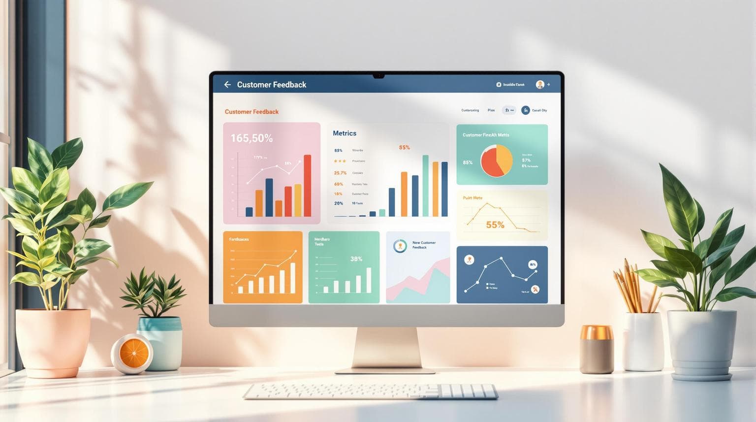
Top 6 Customer Feedback Dashboard Metrics to Track
Want to improve customer experience and drive growth? Start by tracking these 6 key metrics on your feedback dashboard:
- Customer Satisfaction Score (CSAT): Measures how happy customers are with your products or services.
- Net Promoter Score (NPS): Tracks customer loyalty and likelihood to recommend your brand.
- Customer Effort Score (CES): Shows how easy it is for customers to resolve issues with your business.
- AI-Powered Sentiment Analysis: Analyzes customer emotions in feedback to uncover hidden insights.
- Response Time Metrics: Monitors how quickly your team resolves customer inquiries.
- Feedback Volume Trends: Identifies patterns in customer feedback to spot issues early.
Why these metrics matter:
- Businesses using feedback dashboards are 2.5x more likely to achieve 10%+ annual revenue growth.
- Acting on feedback data can boost revenues by 4-8% compared to competitors.
Tracking these metrics helps you improve customer experience, act on insights quickly, and achieve long-term growth. Let’s explore each in detail.
Customer Experience Metrics: NPS, CSAT or Customer Effort: Explained!
1. Customer Satisfaction Score (CSAT)
CSAT is a direct way to measure how satisfied customers are with your products or services. It’s a quick snapshot of whether you're meeting their expectations. For instance, as seen in revenue growth examples, CSAT can directly influence business outcomes by showing the percentage of satisfied customers (those rating 4 or 5).
The formula is simple: take the number of satisfied customers (ratings of 4 or 5 on a 5-point scale), divide it by the total number of responses, and multiply by 100. For example, if 80 out of 100 customers rate positively, your CSAT score would be 80%.
When designing an effective CSAT dashboard, focus on these three key components:
| Component | Purpose | Visualization Type |
|---|---|---|
| Current Score | Displays real-time satisfaction | Gauge chart with color zones |
| Trend Analysis | Tracks changes over time | Line graph with weekly trends |
| Segment Breakdown | Compares performance by category | Bar chart by department/product |
"Customer Satisfaction Score is the most powerful tool for identifying immediate issues and opportunities".
Here’s an example: A telecom company increased their technical support CSAT from 65% to 80% in just three months by improving employee training and troubleshooting systems.
To get the most out of your CSAT dashboard:
- Highlight rolling averages and compare satisfaction across different touchpoints.
- Connect CSAT data with other business metrics, such as revenue.
The industry average CSAT score is 75.7%. However, tracking trends and focusing on improvements over time often provides more actionable insights than just aiming for a single number.
While CSAT measures immediate satisfaction, the next metric dives into customer loyalty and advocacy over the long term.
2. Net Promoter Score (NPS)
CSAT gives you a snapshot of immediate satisfaction, but NPS digs deeper, measuring long-term loyalty and how likely customers are to advocate for your brand. It all starts with one straightforward question: "How likely are you to recommend our company to a friend or colleague?"
To calculate NPS, subtract the percentage of Detractors from the percentage of Promoters. Here's how customers are categorized:
| Customer Type | Score Range | Characteristics |
|---|---|---|
| Promoters | 9-10 | Loyal supporters who help your brand grow |
| Passives | 7-8 | Content customers but open to switching to competitors |
| Detractors | 0-6 | Dissatisfied customers who may harm your reputation |
"Net Promoter Score is the single most reliable indicator of a company's ability to grow." - Fred Reichheld, Creator of NPS, Bain & Company
If you're using an NPS dashboard, ensure it includes these essentials:
-
Score Monitoring and Analysis
Display your current NPS alongside historical trends. Break down scores by segments and pair them with direct customer feedback from detractors to uncover pressing problems. -
Response Management
Set up alerts for low scores and enable fast follow-ups with unhappy customers to address their concerns.
To get even more value out of your NPS data:
- Compare results across different products or customer groups to spot trends.
- Analyze score distributions to find recurring issues.
- Automate workflows to ensure feedback is acted on promptly.
For a broader view of customer experience, consider pairing NPS with Customer Effort Score to measure how easy it is for customers to interact with your business.
3. Customer Effort Score (CES)
CES zeroes in on how much effort your customers need to put in when dealing with your business. Unlike NPS, which gauges loyalty, CES asks a simple but powerful question: "On a scale of 1-7, how easy was it to get your issue resolved?"
| Score Range | What It Means | Impact on Experience |
|---|---|---|
| 1-3 | Low effort | Creates a positive experience; customers are more likely to stay |
| 4-5 | Moderate effort | Indicates potential friction that needs addressing |
| 6-7 | High effort | Signals a risk of losing customers; immediate action required |
To make the most of CES, track it across various customer touchpoints. This helps pinpoint where customers run into trouble. Modern dashboards can even send automatic alerts when scores climb above 5, using AI to flag high-risk cases. Visualizing CES trends over time - broken down by service channels or customer groups - can help you catch issues early.
"Customer effort score is the strongest driver of customer loyalty." - Matthew Dixon
Consider this example: Slack used CES data to slash response times from 24 hours to just 5 hours. Research also shows that improving CES by just one point can boost customer loyalty by 17%.
Tips for Using CES Effectively
-
Address High-Effort Scores Quickly
Set up automated alerts for scores over 5 so you can act fast and improve the experience. -
Pair Data with Customer Comments
Use customer feedback alongside CES scores to uncover the reasons behind high-effort interactions.
To get the most accurate insights, measure CES right after key customer interactions. While CES focuses on the effort customers put in, the next metric dives into how they feel about your brand using AI-driven sentiment analysis.
sbb-itb-bca9945
4. AI-Powered Sentiment Analysis
AI-powered sentiment analysis goes beyond traditional metrics by interpreting customer feedback to uncover emotional insights. It categorizes comments into positive, negative, or neutral, providing a deeper understanding of customer emotions across various communication channels.
| Sentiment Type | What It Measures | Business Impact |
|---|---|---|
| Positive | Satisfaction, praise, enthusiasm | Highlights practices worth replicating |
| Neutral | Factual statements, inquiries | Points to areas needing more emotional engagement |
| Negative | Complaints, frustration, disappointment | Identifies problems that need urgent attention |
Advanced tools not only categorize feedback but also detect subtle emotional patterns. For example, Airbnb used sentiment analysis to find that 23% of negative reviews were about cleanliness. Acting on this, they improved cleaning protocols, which led to a 15% drop in cleanliness complaints within six months.
Key Dashboard Features
The best sentiment analysis dashboards offer:
- Real-time tracking across multiple channels
- Historical trends to spot patterns over time
- Automated theme detection for recurring issues
- Platform-specific alerts for targeted problem-solving
Turning Sentiment Insights Into Action
To make sentiment data work for your business, consider these steps:
- Use feedback to prioritize product updates based on specific features.
- Analyze service-related comments to improve support team performance.
- Build marketing strategies around positive emotional triggers.
This approach pairs well with metrics like CES. Quick response times, for example, can shift negative sentiment into positive experiences, improving overall customer satisfaction.
5. Response Time Metrics
Response time metrics track how fast your team addresses customer questions and concerns. Delays can be costly – 33% of customers will switch to a competitor after a single bad service experience.
Response Time Benchmarks by Channel
| Channel | Target Response Time |
|---|---|
| Live Chat | Under 1 minute |
| Social Media | Within 60 minutes |
| Email Support | Under 12 hours |
| Phone Support | Under 3 minutes hold time |
Impact on Customer Experience
Vodafone's AI chatbot, TOBi, is a great example of improving response times. It managed 70% of customer inquiries automatically, cutting wait times significantly across all channels. Quick resolutions also influence customer sentiment - 68% of people revise negative feedback to positive when issues are solved promptly.
Response Time Management Framework
| Metric | Target | Priority Level | Example Cases |
|---|---|---|---|
| First Response Time | <30 min | Critical | Service outages, security issues |
| Average Resolution Time | <4 hrs | High | Billing errors, product issues |
| Channel Performance | <12 hrs | Medium | Feature requests, product inquiries |
| General Feedback | <24 hrs | Low | Suggestions, general comments |
To stay on top of response times, tools like real-time tracking, automated notifications, AI routing, and performance analytics are key.
"The speed at which your company can respond and help solve your customers' problems is crucial to the success of your business." - Shep Hyken, Customer Service and Experience Expert
While fast responses boost efficiency, analyzing feedback trends can reveal what matters most to your customers.
6. Customer Feedback Volume and Trends
Tracking response metrics is essential for measuring efficiency, but looking at feedback volume patterns can uncover deeper insights. For instance, a sudden increase might point to operational issues, while a steady rise could hint at changing customer expectations.
Volume Distribution and Response Thresholds
| Channel | Priority | Action Trigger |
|---|---|---|
| Social Media | Critical | Over 30% increase |
| Email Surveys | High | 15-30% increase |
| In-App | Medium | Less than 15% change |
AI tools can analyze these patterns, turning raw data into actionable insights. This helps businesses identify potential problems early, preventing dips in metrics like NPS or CSAT. By staying ahead of issues, companies can tackle problems before they escalate.
Response Framework
| Feedback Volume Change | Required Action | Timeline |
|---|---|---|
| Over 30% spike | Activate emergency response team | Within 2 hours |
| 15-30% increase | Department head review | Within 24 hours |
| 5-15% fluctuation | Standard monitoring | Weekly review |
| Less than 5% change | Regular tracking | Monthly analysis |
"Understanding the ebb and flow of customer feedback volume is crucial. It's not just about the quantity, but the patterns and insights hidden within those numbers that can truly transform a business." - Sarah Thompson, Chief Customer Officer at Zendesk
Spotting trends early is key to addressing systemic issues. By combining volume trends with sentiment analysis and response metrics, businesses can create a complete picture of their customer experience. This approach supports both immediate actions and long-term strategic planning.
Conclusion
Tracking six key metrics - CSAT, NPS, CES, AI sentiment analysis, response times, and feedback trends - helps teams turn data into customer experience strategies that deliver results. Businesses that use these metrics well can build stronger customer connections and achieve long-term growth.
Success depends on how organizations apply these metrics across different teams. To make the most of them, consider these practices:
- Regular metric reviews: Weekly check-ins to monitor key data points.
- Aligning with goals: Quarterly reviews to ensure metrics match business objectives.
- Cross-team collaboration: Monthly meetings to turn insights into actionable changes.
- Quick issue resolution: Protocols for addressing problems as soon as they arise.